If you’ve worked with computers for any length of time, you know how easy it is to collect data, and yet how hard it can be to make the best use of that data. In this section, we’re going to suggest some ways you can help your audience understand the raw data you’ve collected.
Let’s make sure we’re working from the same set of terms.
Data. A set of symbols. It can be characters that make up an e-mail, bits that make up a photo or a fax, numbers in a spreadsheet or a database. Everything stored on your hard drive is data. An example of data: 6044085722
Information. Data that has been assigned meaning. In daily life, you’re probably used to dealing with massive amounts of information ‑ that is, data that has been manipulated and sorted to become something meaningful, like the To, From and Subject of an e-mail or columns in a spreadsheet. An example of information: Phone: 604-408-5722
Knowledge. For information to be truly useful, it has to be displayed properly. Consider the difference between these two displays of data:
W.P.: 604/408/5722
Work ph.: (604) 408-5722
Both are information, but one can be more generally understood with less effort than the other. When information is arranged and organized well, it can become knowledge – patterns can be detected, meaning can be extracted and additional inferences can be drawn.
As a niche publisher, you have a special opportunity to gather and share data that might not regularly be available to your audience. Data in its raw form can be useful to a small subset of your readers. But if you take that data and put it into a meaningful form, such as a chart, a graph or a timeline, your audience can more easily absorb, remember and draw useful inferences from what was once just raw data.
So, with the idea of starting with data and ending up sharing knowledge with your audience, let’s talk about some common ways to display data.
Charts and Graphs
When people think about visualizing data, a chart pops to mind, something like this:
| POPULATION: MASSACHUSETTS AND TEXAS, 1990-1994 | |||||
| 1990 | 1991 | 1992 | 1993 | 1994 | |
| Massachusetts | 6,018,000 | 6,002,000 | 5,999,000 | 6,018,000 | 6,041,000 |
| Texas | 17,045,000 | 17,344,000 | 17,667,000 | 18,022,000 | 18,378,000 |
(We’re using the example chart from http://www.learner.org/exhibits/dailymath/getpicture.html )
A chart like this can be done quite easily on the Web. In fact, there’s a handy set of HTML tags that help create tables – the TABLE, TH, TR and TD tags. (See the HTML section)
Chart or Graph?
In practice, these terms are often used interchangeably. However, a chart is a more general term meaning any organized display of data, whereas a graph is usually meant to describe the display of information in the form of an image that has an axis of information.
To help you remember: Graph paper isn’t called chart paper. It is paper with an even grid of small boxes that makes it simple to draw graphs on it.
Charts are most useful when you have information that people will want to be able to reference exactly. With a chart, they might be able to cut actual numerical information from one document and paste it directly into another.
There is, however, the old expression that a picture is worth a thousand words. In many cases, a graphical presentation of data helps bring out differences and relations that are not clearly visible from the numbers themselves.
Taking the chart above, we’ll make it into a pictorial form to promote better understanding. Probably the easiest way to do this is with Microsoft Excel. If you don’t have Excel, you can use the open-source “OpenOffice” or another spreadsheet tool; the steps will be similar though the commands will not be exactly the same.
1) Launch Excel, and make sure you’re looking at a new blank document.
2) Type in the data from the chart above. You should have the column headers across the top, and the row headers down the side. If your numbers or words are too wide for the columns, you can click and drag the dividers between the cell headers to make the columns the size you need. If you’d like to skip the data entry, you can click here to download a pre-filled Excel spreadsheet.
The Microsoft Way
Excel refers to every pictorial display of data as a “chart,” even if that display could also be properly labeled a graph. At the same time, it excludes many types of numeric displays that are charts.
Specifically, the PivotTable function can generate some very nice charts, though a proper exploration of PivotTables would be a week-long class (http://lacher.com/toc/tutpiv.htm).
For the sake of clarity, during this tutorial we will use the Microsoft term “chart” because of the way the tools and dialogs are labeled. However, both terms are correct.
3) Select the data you want to make into a graph. In this case, leave out the main chart label and just select the columns and rows from A2 to F6.
4) Go to Insert -> Chart Wizard. A dialog window will appear to help guide you through the many chart choices.
5) Choose the type of chart. For this data set, 3-D columns are probably the best choice. Once selected, click Next.
6) For this chart, make sure the Data range is set to ” =Sheet1!$A$3:$F$4″ (“Sheet1″ is the name of your worksheet. “$A$3″ is the starting cell, “$F$4″ is the ending cell, and the data selected is everything between those two cells.) Excel might automatically have selected $A$2 instead of $A$3 – this causes an extra row of data to appear on the chart. But if you followed the example, that top row is really not data but rather a row of headers. You want those headers to appear on the chart, so click “Series” at the top of the window, and in the Category (X) axis labels, enter ” =Sheet1!$B$2:$F$2″. Then click Next.
7) In this next section, you can make a number of choices about how the chart is going to be labeled – where the lines of the chart will appear and so on. The defaults are probably fine for now, except that it will look better if you click the “Legend” tab at the top and uncheck the “Show legend” box. When you’ve customized the chart to your liking, click Next.
8) Choose to place the chart in your current worksheet by clicking with the cursor and drawing a box. Make sure you’re placing the chart as an object (the default choice). Click Finish.
Choosing Chart Type
Different groups of data call for different charts.
Here’s a quick guide:
- If you have data that adds up to 100% without overlap, a pie chart – a large circle with wedges indicating various portions – is often the way to go. Example: A poll.
- If you have a set of values that changes smoothly over time, a line chart works well. Example: Gas prices or average speeds.
- If you have a set of values that are measured at regular intervals, a bar chart might make sense. This is especially true if you want to subdivide the results. Example: Population every census; population with additional male/female ratio data.
9) Finally, you’ve produced a 3-D column chart. At this point, there are still many ways to modify the chart’s colors, fonts, size, and more. You accomplish this by right-clicking (or on a Mac, control-clicking) on the chart. Most important, though, is the ability to right-click on the outer edge of the chart and choose “Save as Picture” from the menu that appears. You can save the chart in any standard Web format – PNG is a fine choice – and upload the chart as you would any other image file (INCLUDE LINK) on your website.
HTML Charts
For simple bar charts, you can use a different method of producing a graphical display of data that can be done directly with HTML – no Microsoft Excel needed. All you need are several very small GIF images in a solid color.
Let’s say you wanted to display the results of a website poll as a graph. For the purpose of this example, we’ll say the question is “How many days a week do you work?” and the answers and relative percents are as follows:
- Less than three: 25%
- Three: 15%
- Four: 20%
- Five: 30%
- More than five: 10%
It would be more effective if you could represent this in a visual format and would probably encourage better recall by your readers and perhaps even higher participation in the poll.
By using HTML to stretch the small GIF image into several differently proportioned rectangles, you can have a bar chart with minimal hassle.
First, calculate the length of each image proportionally. So, if 100% would be 600 pixels across, 25% of 600 pixels is 150 pixels for the first bar, 15% of 600 pixels is 90 for the second bar, and so on. With some basic HTML code like this, you’ll end up with a clearly understood chart:
<IMG SRC=”/images/zred.gif” height=”11″ width=”150″ alt=”"> Less than three<br>
<IMG SRC=”/images/zred.gif” height=”11″ width=”90″ alt=”"> Three<br>
<IMG SRC=”/images/zred.gif” height=”11″ width=”120″ alt=”"> Four<br>
<IMG SRC=”/images/zblack.gif” height=”11″ width=”180″ alt=”"> Five<br>
<IMG SRC=”/images/zred.gif” height=”11″ width=”60″ alt=”"> More than Five<br>
The final result will appear like this:
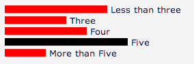
Even a beginning programmer would be able to take the simple output of a set of votes, count them and apply those proportions to an image. By using different colors for the top result or for different polls, you can create dynamic, easy-to-update bar charts using only simple HTML.
Additional Charting Software
If basic Excel charts aren’t enough, more advanced image creation and manipulation techniques are always an option. You may want to create images on the fly from a continuously updated set of data, like placing markers on a map or creating relational drawings showing connections between various people or agencies.
To do this, you would need to have software that runs on your server, written in Perl, PHP or ASP, that generates images as people request them. Two common image manipulation libraries are ImageMagick (http://www.imagemagick.org/) and GD Graphics Library (http://www.boutell.com/gd/). There are many different ways that these programming languages can generate images. Teaching one of these languages, especially the advanced techniques of image manipulation, is beyond the scope of this site. But a competent Web programmer would be able to come up with a tool that could generate many images in whatever size, shape or detail you want.
Calendars
One other common way to represent data is in a calendar format.
Many blogging and CMS tools will have built-in functions to display calendars and to provide archives that organize data by date. website users commonly will attempt to look up by date articles or other data they’ve previously found.
When creating a calendar, there are a few things to keep in mind.
First of all, make sure it’s easily identifiable as a calendar by having it follow the conventions of your culture’s calendars. For North American monthly calendars, that means it’s organized horizontally, with weeks starting on a Sunday. If you can, make the whole box of a day clickable, not just the number – it’s easier to click on the box. If you are putting text in the day boxes, try to keep the boxes equally proportioned, don’t squish empty days down to nearly nothing.
Finally, it’s often quite easy, and very considerate, to provide an alternate interface for calendar data, like a simple listing with day headings.
Advanced Data Visualization
There will be occasions when a particular project calls out for a significant effort to present data in a non-textual way.
Think, for example, of a story about a new museum that’s opening or a concert hall. Allowing people to review the construction plans, and even manipulate and create alternative versions, is extremely useful in helping your readers comprehend something like this.
Or for events that unfold over a particular time frame, especially when there are very large numbers of people or actions and reactions, a timeline can be an excellent way to display information.
If you are interested in learning more about data visualization techniques, one of the most respected experts in this field is Edward Tufte, http://www.edwardtufte.com/tufte/.
There are some general steps you need to take to end up with something like this.
1) Decide what you’re trying to explain. In many ways, this is the hardest part. You need a clear idea of what you want your readers to be able to take away from the site after they’ve engaged with your creation.
2) Sketch out an interface. This can be something simple, drawn on graph paper. It can be a mockup in Photoshop. Or it can be a basic, black-on-white dynamic HTML page. Different Web editors might approach this in different ways, but the idea is to proceed with something tangible.
3) Gather your materials. This might be photos, audio clips, color choices.
4) Repeat steps 2 and 3 several more times, because they influence each other. As you find out you have a wealth of archive photos, your photo-handling interface might need to be expanded or redesigned.
5) Think about the flow - not only how you’d like people to click through the data you’re assembling, but how you don’t want them to click. Consider what they might, perversely, try to do – like zoom a map too far out or put all zeros in a budget simulator.
6) Decide on a programmer and a programming method. Make sure you’re not going to exclude your target audience – things built in Java or that require the latest browser might not be as good as something built with Flash or with basic HTML forms.
7) Think about wider implications of your application. For example, decide if there are any privacy concerns. Think about how you’re going to handle the possibility of additional traffic due to the application. Think about any long-term data storage or backup needs.
8) Keep on schedule. Have a launch date in mind and work back from that.
9) Think about how long the data feature will live. Make sure you have a plan for how you’ll transition it to inactive status. These sorts of features can be great link attractors, and yet the purpose of the feature might have a natural sunset, for example if it is for a certain budget year, or a sporting event that will take place and then pass. Having a nice clear label that this is a discontinued data tool will let people continue to enjoy it without being confused or angry that some parts of it are no longer valid.
10) Finally, after a long stretch of development, test it. There is no chance to make a second impression, so it’s often a good idea to let a select few come in early and try it out before you unveil it to your entire audience.